Wednesday, 20 April 2016

NA7: Audience Research and Analysis of Both Products

Newspaper Advert Reseach
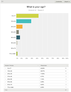
Around 70% of the people who filled out my survey for my newspaper advert were aged under 25. This is ideal to target my target audience because over half of that age category fall under my primary target audience age of 12-30. 
The majority of the people who have filled this survey out had a household income of less than £50,000. This is perfect because my my primary target audience is of a class background from middle to lower class.

There was an even split in the gender of my audience in this survey. My documentary is aimed at men so I would have preferred a 70-30 split towards males just so that I could get a true understanding from my target audiences point of view.

Nearly everyone who filled this out are white British. Because I aimed for white British audience members for my target audience, then I am glad that my main audience were reached via this survey.
I have predominately aimed my documentary at heterosexual men. Therefore the audience that answered this survey are the same sexuality balance that I have tried to take into account when planning my products.
As over 50% do not read newspapers, then they may not be the best people to criticise or give advice on my planning choices. However, if they see their ideas and thoughts come to life, then they may start to read newspapers based on the effect they may have via my advert.
From this, audiences stated that my content and images were the two most important features to consider as part of my advertising poster. I shall therefore base my content around my images before then considering other popular features such as colour and layout.
I feel positive about this answer as despite 64% saying maybe, I am more concerned about the percentage who outright said that they would not watch this which was only 11.9% which based on the gender and ages who answered etc is very good percentage. I feel that with a good advertising campaign I would be able to sway a lot of the people who answered to want to watch my documentary.
Considering 35% of people claimed not to watch sports documentaries and only 11.9% claimed that they would not watch mine, then not only has my documentary had a 24% increase in popularity to typical genre stereotypes but I am also making a valuable contribution into increased then genre popularity as a whole. This means I am making a valuable contribution to the industry.

As 60% of my audience follow football, then on average this is the most popular sport in the country which is good as I have chosen the sport which is more likely to draw the biggest audience out of all the possible options. 

Channel Listings Research:


Nearly 90% of everyone who filled out my survey were aged under 25 which is exactly the age range I want viewing my documentary.
This again was an even split which is not ideal based on my male target audience. However, I can consider my secondary audience more within this survey.
Everyone who filled out my survey was of either a lower class or middle class background which suits in the best possible way to my target audience. This will make my documentary seem more down to earth because I am not aiming at upper class families.
Everyone who filled out my survey  was white British is very helpful as this ethnic group is the one that my target audience is based upon.


The sexuality aims from my documentary are heterosexually based which is helpful from this survey as all but one of my subjects are of a heterosexual orientation.
This is slightly concerning as all but one person said they did not read channel listings magazines which may give may false information as they might not know what they are talking about.
Based on what my audiences have said, I shall mainly focus my work around my images, colour and content. I expected this to be the case as these are the more notable features.
Considering only 1 person claimed to have sometimes read channel listings magazines, then I was very encouraged by this next question. This shows that 75% would be at least tempted or would happily watch my documentary which means despite earlier concerns, my documentary can easily still be a success.
I am evenly split between people who currently watch sports documentaries so there is a very good chance of this percentage being increased. The fact that 50% of my survey do watch sports documentaries that my audience are already and excited and looking forward to the release of 'Life After Football'.
Similarly to my last survey, Football has once again proved to be the most popular sport in this country which is a good point as it proves that this will be more likely to successful than a documentary on rugby or cricket for example.

NA6: Layout Conventions for Both Products


Despite this newspaper advert and this channel listings article being two very different forms of advertising materials both of them feature a lot of common layout features. The main similarities that these two adverts/articles have are: 

  • Both pieces of work have been based around the main image.
  • Both use text over their main image as if they didn't they would be wasting space that they can use for other features.
  • Both feature medium shots of their star vehicle/s as their main image which helps to show off the attire that they are wearing.
  • Both have laid out their title three quarters of the way down their main image. If they hadn't have done this then it might have not looked as effective.
As they are two very different pieces of work, then there are features that one will have included which the other has not. These include
  • Secondary images that help big up and support the main image.
  • Even proportions between text and imagery which gives across the point that the layout is very well planned out and that everything is not just thrown about everywhere. 
  • Large subtitles over the main image to give an extra insight on what you are about to be reading. 
  • Large titles of the release date of the tv show/film.
  • Critic ratings to give the audience an impression of how good the film/ tv programme is that they are about to go out and watch. 
  • Quotes from critics.


NA5: Detailes Codes and Conventions of Articles


All of these articles have a lot of similarities and differences. The key similarities between these are:

  • Tv Times/ Company banner in the top corner to connote the brand or whats on TV for that week.
  • Quotations by actors and people associated with this programme as it gives you a personal touch about their opinions about both the programme and what you are reading. 
  • Bold sans serf title as it is an article so it needs to stand out and draw audiences in just a few words.
  • Captions on all main images and sub images to describe what is going on in the photo that you see.
  • Subtitles which give a little piece of extra information about the article that links to the title. It also gives off a cryptic clue prior to what you are about to read.
  • Information inside the article about the TV Show, Documentary or Film being advertised.
The points I have discovered are clearly the main conventions of TV show articles but other information and features can be used but is not as important nor crucial.

  • A separate banner on the article advertising the channel and release time of the documentary. 
  • A section inside the article solely based on behind the scenes gossip.
  • A paragraph on how the programme was created and produced. 


NA4: Common conventions from Documentary Posters


After analysing documentary posters I have decided to compare which these 3 famous football documentary posters have in common. They are all individual and have their own style but they all have similarities.

List of common conventions from football documentary:
  • They all feature one main image which features the key focal of the documentary which particularly stands out in their posters.
  • They all have big bold titles that are sans serif of the names of the documentary.
  • The colour schemes of all 3 documentaries connote the teams they are based on. 
Dependant on whether the documentary is released into cinemas or straight onto DVD, they all have different information that can or cannot be advertised as additional information. These include;

  • Release date into cinemas and/or dvd.
  • When they will be broadcasted onto television.
  • What tv station they will be broadcasted onto.
  • Quotes about the documentary from famous people and companies.
  • Who stars in the documentary.
  • What production company produced the documentary.
  • Who directed the documentary.
  • A brief subtitle into the story of the documentary. 
  • Secondary images that help to set the scene of the documentary.


Sunday, 17 April 2016

NA3: Analysing 3 TV Listings Articles


The first article I have analysed is by TV Times and this particular advert is for TV show 'Broadchurch'. They have used imagery in a clever way. Their main image takes up half of their advert which really makes the article both stand out and clearly display that you do not need to know the show to realise that these are the star vehicles. As this is a crime drama, they have set up the rest of the article to look like a classic 'Whodunnit?' scenario which even includes six potential suspects on the bottom half each with a small piece of text about them to explain to readers who don't watch the show their motives etc. In this sense, imagery is used very to create tense and suspension as well as an affective read.

In coherence with its imagery, the layout of this article is also very catching to the reader. Even from a distance you can tell that the show is reaching a crucial stage in the series which makes the article an instant read straight away. It's layout connotes that its a serious drama as it would be extravagant and all over the place if it was either a comedy or children's show for example. I shall have to adopt a similar style with my documentary as it is a very serious matter.

It uses a very traditional black and white text colour scheme as its a intense crime drama and they do not want to give their audiences the wrong impression about the genre of this show. Red is also used as this is a police drama and it connotes that a police investigation is being carried out. Red, black and white connote the truth as well as originality which is the exact aim I am going for. Its basic and straight to the point which is what I want 'Life After Football' to portray.


Typography is used with a Sans serif font as it has a more formal connotation. The bold title is simple, effective and does not waste anyones time. Like police dramas do, they intend to cut straight to the chase and do not aim to mess anybody about. Because I also want to cut to straight to the point, I have used a simple yet effective title of 'Life After Football' and I shall also aim to reflect this when it comes to creating a strong font and typography style. If I used a colourful and edgy title it would not reflect my target audience or my genre.


This advert uses imagery to its advantage. As Christopher Ecclestone is clearly the star vehicle in this advert, they use a large image of him to show that he is the main star. As this drama is from a similar time period to when he was playing Doctor Who, this advert has clearly tried to use his fame and fan base to both make this article stand out and to attract an audience. This is a clever idea as you are tricking audiences into reading it with just a simple image. I shall therefore use one of my star vehicles Jamie Lowry in the same manner. As people will recognise him from his playing days, they will want to watch a documentary about how his life has changed from his glory days. I will make sure it's obvious that he is an ex-professional player so therefore general football fans will be enticed if its an extra opportunity to watch football.

This advert has a fairly even text to image ratio. The top half is the one that is more likely to be seen hence the image of the star vehicle is covering the top half of the article. Because audiences from a far will only see the top half, the large image of the star vehicle will make them want to read more into both the image and the television show being advertised. I shall incorporate a similar style when I consider the layout choices in my listings magazine. I will mainly use a combination of styles from listings magazines and football magazine to create my ideal blend.


Similarly to the Broadchurch advert, this adverts primary colours are black, whit and purple compared to the black, white and red which is used for Broadchurch. TV Times have clearly used a similar structure to portray colour for yet another serious crime drama. Purple often connotes the underworld and being supernatural. This links to Christopher Ecclestone because he is known as being Doctor Who and the combination of purple is attempting to attract fans of Doctor Who to watch this crime drama. By using a famous star vehicle such as Jamie Lowry, people who remember his playing days will want to see a documentary in which he features. I will combine the use of his face with a football orientated colour pallet. 


The typography style is sans seriff. This has been done because it is a serious tv show and it is important to show this contiunity through all varities of merchandising. On this basis, it would be against character to use a serif font style. I shall use sans serif in mine as i personally feel that it looks more serious and professional. Its basic colour also connotes its serious and that they do not want to come across as light hearted.


Imagery is used a similar way to that which is used in the first article for Broadchuch. This is because they use lots of smaller images alongside the main image. I think this a great of publicising shows as the more pictures, the more you get to learn about a show before watching it. If the imagery from this only had a large image, the article would look nowhere near as professional nor interesting as it does now.

Compared to the other two adverts, this adverts layout features a lot more imagery. However, similarly to the other two adverts, this is balanced out as there is more text than the other two adverts so therefore it doesn't look either text or image heavy.  Similarly to the other two articles, this article is solely based around the main image which means the key image is main focal point of the article from a distance.

Similarly to the Christopher Ecclestone advert, the main primary colours are white black and purple. In this case, the purple is used to connote passion between the two star vehicles as you can clearly see that they are a couple. The black is used to show that they confident about themselves and supports there quote 'older people aren't de credit, daft and dotty'. This show is therefore about tackling old age head on and not falling into generally old age pensioner stereotypes. I shall use a large quote from my star vehicle Jamie Lowry as a title for my article as I that it is the best way to capture audiences into watch a documentary.

As this a drama about an old couple, sans serif has been used as they want to support the traditional genre of the show. If they used serif fonts in this article, they will make audiences believe that this show is not continuous and consistent with its marketing and advertising and will then start to question the quality of this tv show. Therefore, I shall match my typography style to my genre throughout all of my work.


NA1: The Importance Of Promotional Material

Whether it is a poster, advertising feature in a magazine or even a coffee mug, promotional material is very important into making any TV show, film or documentary successful. Regardless of what you are producing it is vital  to make and sell the right merchandise for the right product. In my case I have made a documentary so I feel that when it comes to producing my two products for my ancillary tasks the best way to attract my target audience is by producing a poster for a newspaper and a feature article on my documentary for a channel listings magazine.

My primary target audience are men aged 12-35 who are of classes C1-E and of a heterosexual orientation. Because this is the lower end of the class spectrum then these are the kind of families that are likely to read newspapers and watch TV for the majority of their spare time so therefore they are more likely to see adverts in newspapers and channel listings articles compared to higher class woman and children.

My secondary audience are men and women aged over 35 of all classes and because television and newspaper reading are two of the most carried out past times in this country, you are more likely to get a wider variety of people seeing about this documentary rather than if I solely advertised this using billboards and radio advertising.

In regards to my genre, I again feel that these two advertising methods will appeal in the best possible way to represent my target audience. To keep track of the sport two of the most popular methods in this country are by watching sport and sports channels on TV and alternatively reading the sports section in a newspaper. So by advertising in newspapers and channel listings magazines I am again advertising solely to represent both my target and secondary audiences.

Friday, 15 April 2016

M31: Evidence of Ongoing Editing


I like the amount of footage of my star vehicle coaching in my first draft of Life After Football. However there is not enough footage of him playing and just seems like a collation of random footage. I also did not add professional assistances such as captions or channel logos either.


I feel that my second draft is better than my first for a couple of reasons. The first of which is that there is a lot more footage of my star vehicle in his professional playing days. This will make audiences recognise him more whilst being able to reflect back on his career and how much it has changed. There is also a better sequence of events which helps to make 'Life After Football' flow more


My final documentary looks a lot more professional than my first two attempts. I have featured the production company, the channel logo and I have even added a caption. These little additions all connote professional publications which is what Life After Football now represents. I am very happy with this as it reflects the creative journey I have come on since September.