
Thursday, 21 April 2016
NA12: Flat Plan of Poster With Feedback

NA11: Photos for Ancillary products with Feedback

I like this photo as it is solely focusses on my star vehicle. I like the that the is centred in this image whilst in kit and during a professional match. It is focussed well and I shall probably crop this and use it as a secondary image.

I personally love this image because of the way I have managed to contrast the front and and back of this image in terms of focus. Based on my serious approach I think that this will look fantastic as a main image for either my poster or article.

I like this as it shows that my star vehicle is a determined athlete both in and out of football. My star vehicle in this particular shot is modern than when he was in his prime. This can contrast to back in his main playing days when he was younger and possibly less knowledgable which may have led to the prolonged injury and shortened career.

This is a similar image to one used in traditional football magazines because of the way it is angles and shot. I used a style model from FourFourTwo magazine before recreating an article on Gylfi Sigurddsson. This image will be the main image for my article as this is there it was probably look best.
NA10: Article Copy
Life After Football is an inspiring documentary that focusses on professional footballers and how their lives dramatically have changed. Looking at archived footage as well as extensive interviews with all of the players involved in this documentary. Writer and producer Jonty Colman came up with the idea after playing under ex Chesterfield midfielder Jamie Lowry at Bodmin College Academy.
Jamie was forced to retire from the professional game aged 26 having made over 130 appearances in Leagues One and Two. Since retirement, Lowry has moved into the coaching side of the game working with youth at Exeter City, as well as being the Head of Youth Development at Godolphin Atlantic and the Head Coach of the Bodmin College Football Academy.
We hear the shocking stories behind how one injury can subsequently ruin a professional career and how both physically and mentally a players life. How a player like Richard Flash, can go from training with the Class of 92 and living with David Beckham, to only playing 11 professional matches in his entire career and retiring aged 23.
NA9: Short List of Design Ideas for Article with Audience Feedback
Fonts:
Colour:
Layout:
Design:
- Sans Seriff- My documentary and my poster both feature sans serif font styles throughout. I feel that if I keep this the same then it will look good in terms of continuity and I am also available to keep a strong brand as well as keeping to the serious manner that I have displayed throughout. My audience feels that solely based on continuity issues I should stick to this font style.
- Seriff- Some of the issues I discuss in the documentary and the accompanying products have an edgy twist so it might come across as a slightly edgy documentary. After considering this further and discussing it with my target audience, we collectedly decided that this would not be a good idea.
- Impact- As I wanted my serious approach to shine throughout, I considered using impact for parts of my write-up based on its very thick and block font approach style. My audience told that this was too childish for my 12-30 male target audience so I then went against using this.
- Helvetic Neue 95 Black- Its a very serious and bold font which is what I like about it. I feel that this is one of the best possible fonts for the approach I am going for. My audience say that I should consider as long as it follows the conventions and font styles used by the channel listings company that this is being made for.
Colour:
- Brown- As well as connoting stability which is clearly tested and challenged by people who featured in this documentary but brown is also connoted with strength. The footballers in my documentary have had to show great strength to bounce back and get their careers kick-started again. My audience think that brown is a good colour to use as it can also be associated with self reflection which is a lot of what my documentary contains.
- White- This combined on top of another colour I feel will look excellent on my work and connotes the lightness and prosperity about what the future might hold. It also represents 'goodness' which connotes that these footballers have just become unlucky and on the whole these are all good people. My audience also agree that white would work very well on top of a darker colour. White would also connote patriotism as he is an English footballer.
- Black- Black connotes traditional football colours of balls and boots. It connotes power which for some of my star vehicles has now become there lives via coaching. It also connotes the dark times that players have faced hence they are featured in here. My audience feel that using colour gives more impact even in terms of a serious article. I may use black as part of my image structure but when its come to deciphering upon my text, I will avoid using black.
- Blue- Blue connote football because it is a common colour used for strips. However, both myself and my audience feel that I should steer away from blue due to its positive connotations.
Layout:
- Basing my article on a footballing example- I am considering looking at styling my article around a real life example from a magazine such as FourFourTwo. By doing this I will be connoting the same types of layout used in industry standard pieces. My audience like this idea because it shows that I am considering my audiences wants and needs from a documentary.
- Using one of my two pages just to make my main image stand out- I have thought about doing this because you see that most successful articles do whatever they can to make their main image stand out. My audience like this as they are likely to recognise a star vehicle if a large image of them is used to take up the majority of my left page.
- Using boxes to use for text which will make my article formal- Doing this will follow of both techniques and methods used in channel listings and football magazine articles. My audience wanted me to do this particularly as it shows clear links between the football and television listings industries together.
- Using a circular speech bubble on my article text- This can help me to highlight significant quotes that stand out more than the rest of the text, This is also used to draw readers in from a far. My audiences said I should use this technique on the proviso that I choose just the right quote for this.
Design:
- Text on top of text boxes- This makes the design of my article seem more catered for. It comes across that that I haven't just wrote a load of unnecessary text on some images. It shows I have carefully planned this and take care into what I am producing for my advertising material. My audience want a piece of advertising to be planned out and cared for and I feel they will be getting via this technique.
- Using bright white text on a darker background layer- I feel it makes the white text connoting a clear future stand out when you place it on a colour such as brown due to its muddy associations.
- Keeping all of my text on one page- This helps me to keep a level text to image ratio in my article. It also makes my main image stand out and my text to have its own recognition that it truly deserves. My audience like that idea but they wanted at least one image on my other side, this links onto my final design idea.
- A smaller action shot of a star vehicle on top of my main text- Doing this adds an exciting touch to my main piece of text which from a distance may come across as slightly tedious. My audience found that the addition of a small action shot adds a lot of character to my article.
NA8: Short List of Design Ideas for Poster
Fonts:
- Apricity (dafont.com)- On a whole, my audiences like this font however that claimed that it does not appear to be thick enough to make a good bold title.
- Grunge Formal (fonts.com)- This came across to be a good title, however as it is designed and used for grunge pieces of work, it might not be serious enough for my documentary.
- The Foundation Collection (fonts.com)- The foundation collection came across as being childish according to audience research.
- Arial Rounded MT Bold- Out of my five options my audience found that this best suited as it seems professional and something which is likely to be used for industry standards. I therefore consulted my audiences to see how I should use and they felt by using it as a title on a bottom banner that it will both stand out and make my main image shine through which is the real aim here.
- Bell MT- I personally wanted to keep all my work using a sans serif font style, I explained to my audience when showing them this font and they happened to agree with me.
- White- My audience felt that white is a good colour to use as part of my work because it connotes England as well as suggesting that I should use this mainly for release date and time as it will go well with a dark border background.
- Green- As this connotes grass and football pitches, then it would only be fitting that this is the perfect background for a advert for a football documentary.
- Red- Audiences claimed that this would be a great colour to use because of its patriotic connotations. However, as I have a very simplistic and down to earth advert then by adding to much variation my colour pallet I may make it more complicated then necessary. I already have this colour incorporated as part of my channel five logo so I am still adding some red into my newspaper poster.
- Black- My audience claimed that black complimented this advert well because it makes a strong background layer for my bottom banner to go on top of. This also connotes colour of classic footballs and classic football boots. It also connotes that the careers of those who feature in this documentary have taken a dark turn from their former glory days.
- Gold- Gold connotes success which could have been achieved both in and out of football. Just because these players they may not have reached the potential they possibly could have. My audiences though that these reasons were good enough to not only feature gold, but to use it for the title colour of my documentary.
- Images of star vehicles as my main image- I felt that this may be a good ideal but my audience felt that it might not come across as serious as it perhaps should do.
- A serious image of a star vehicle- This was a good idea that my audience felt would work rather well because this does a good job of connoting the style and emotion this is featured within my documentary.
- A Bottom Banner- I wanted my images to be the main focal point so by putting all my information on a bottom banner I am therefore getting the right balance between how much I want my images to stand out but also how much I want my text to seem bold and sophisticated.
- Quotes about the documentary on my print work from professional publications- As this is meant to advertise my documentary then in theory this would tell the audiences that other people hold strong opinions and would say are fans of my documentary. My audience however thought otherwise claiming that i may ruin the serious manner that I am aiming for with this advert. They also feel it may ruin what it's about with quotes from certain industries.
- Over laying my bottom banner over my two images- This works as there is a good colour contrast by my banner and my images. It also has a slightly faded affect which connotes to the faded footballers featured in 'Life After Football''. My audience liked the fact that you can still see all of my two images even with the necessary information on it.
- Using more than image- I have used this so that it comes a cross of a faded star vehicle thinking about his former glory days. The audience felt that by turning the opacity down on the close up of my star vehicle, I will get a really professional and industry standard looking advert just via a simple editing technique.
- Placing my banner either at the top or the sides of my advert- I originally thought I should place my banner at the top of my advert but my audience were quick to point out that looks more like a magazine front cover than a advert. Based on this feedback I placed this at the bottom as it also helps my main image to stand out.
- Using logos of football teams in my advert- My audience thought that this was a good idea because it would attract fans from the teams that have been advertised. I went against this feedback because I want football fans from all over the country and possibly the globe to watch my documentation. Because of this I left logos out its creates tension and suspension who or what teams may be used in this piece of work.
Wednesday, 20 April 2016
NA7: Audience Research and Analysis of Both Products
Newspaper Advert Reseach
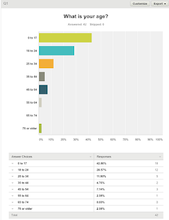
Around 70% of the people who filled out my survey for my newspaper advert were aged under 25. This is ideal to target my target audience because over half of that age category fall under my primary target audience age of 12-30.

The majority of the people who have filled this survey out had a household income of less than £50,000. This is perfect because my my primary target audience is of a class background from middle to lower class.

There was an even split in the gender of my audience in this survey. My documentary is aimed at men so I would have preferred a 70-30 split towards males just so that I could get a true understanding from my target audiences point of view.

Nearly everyone who filled this out are white British. Because I aimed for white British audience members for my target audience, then I am glad that my main audience were reached via this survey.

I have predominately aimed my documentary at heterosexual men. Therefore the audience that answered this survey are the same sexuality balance that I have tried to take into account when planning my products.

As over 50% do not read newspapers, then they may not be the best people to criticise or give advice on my planning choices. However, if they see their ideas and thoughts come to life, then they may start to read newspapers based on the effect they may have via my advert.

From this, audiences stated that my content and images were the two most important features to consider as part of my advertising poster. I shall therefore base my content around my images before then considering other popular features such as colour and layout.

I feel positive about this answer as despite 64% saying maybe, I am more concerned about the percentage who outright said that they would not watch this which was only 11.9% which based on the gender and ages who answered etc is very good percentage. I feel that with a good advertising campaign I would be able to sway a lot of the people who answered to want to watch my documentary.

Considering 35% of people claimed not to watch sports documentaries and only 11.9% claimed that they would not watch mine, then not only has my documentary had a 24% increase in popularity to typical genre stereotypes but I am also making a valuable contribution into increased then genre popularity as a whole. This means I am making a valuable contribution to the industry.

As 60% of my audience follow football, then on average this is the most popular sport in the country which is good as I have chosen the sport which is more likely to draw the biggest audience out of all the possible options.
Channel Listings Research:

Nearly 90% of everyone who filled out my survey were aged under 25 which is exactly the age range I want viewing my documentary.

This again was an even split which is not ideal based on my male target audience. However, I can consider my secondary audience more within this survey.

Everyone who filled out my survey was of either a lower class or middle class background which suits in the best possible way to my target audience. This will make my documentary seem more down to earth because I am not aiming at upper class families.

Everyone who filled out my survey was white British is very helpful as this ethnic group is the one that my target audience is based upon.

The sexuality aims from my documentary are heterosexually based which is helpful from this survey as all but one of my subjects are of a heterosexual orientation.

This is slightly concerning as all but one person said they did not read channel listings magazines which may give may false information as they might not know what they are talking about.

Based on what my audiences have said, I shall mainly focus my work around my images, colour and content. I expected this to be the case as these are the more notable features.

Considering only 1 person claimed to have sometimes read channel listings magazines, then I was very encouraged by this next question. This shows that 75% would be at least tempted or would happily watch my documentary which means despite earlier concerns, my documentary can easily still be a success.

I am evenly split between people who currently watch sports documentaries so there is a very good chance of this percentage being increased. The fact that 50% of my survey do watch sports documentaries that my audience are already and excited and looking forward to the release of 'Life After Football'.

Similarly to my last survey, Football has once again proved to be the most popular sport in this country which is a good point as it proves that this will be more likely to successful than a documentary on rugby or cricket for example.
NA6: Layout Conventions for Both Products


Despite this newspaper advert and this channel listings article being two very different forms of advertising materials both of them feature a lot of common layout features. The main similarities that these two adverts/articles have are:
- Both pieces of work have been based around the main image.
- Both use text over their main image as if they didn't they would be wasting space that they can use for other features.
- Both feature medium shots of their star vehicle/s as their main image which helps to show off the attire that they are wearing.
- Both have laid out their title three quarters of the way down their main image. If they hadn't have done this then it might have not looked as effective.
As they are two very different pieces of work, then there are features that one will have included which the other has not. These include
- Secondary images that help big up and support the main image.
- Even proportions between text and imagery which gives across the point that the layout is very well planned out and that everything is not just thrown about everywhere.
- Large subtitles over the main image to give an extra insight on what you are about to be reading.
- Large titles of the release date of the tv show/film.
- Critic ratings to give the audience an impression of how good the film/ tv programme is that they are about to go out and watch.
- Quotes from critics.
Subscribe to:
Posts (Atom)